The quiet killers of conversion: weak typography, muddy colors, confused layout
If your site looks “nice” but your form fills and calls are flat, I’ll bet on three culprits: thin fonts no one can read on mobile, color choices that hide your CTAs, and layouts that make people hunt for a next step. We see it weekly. Owners tweak copy and throw discounts while the real blockers are visual. Fix those and you can often convert visitors into customers without adding a single new traffic source.
Where this breaks in the real world
- Restaurant sites bury “Reserve” under an image slider and light gray text. A clearer button and tighter layout outperforms by a mile. If you run F&B, read this with your “table turns” hat on.
- Home service pages use multiple brand colors so “Call Now” blends with everything else. Consistency beats creativity here.
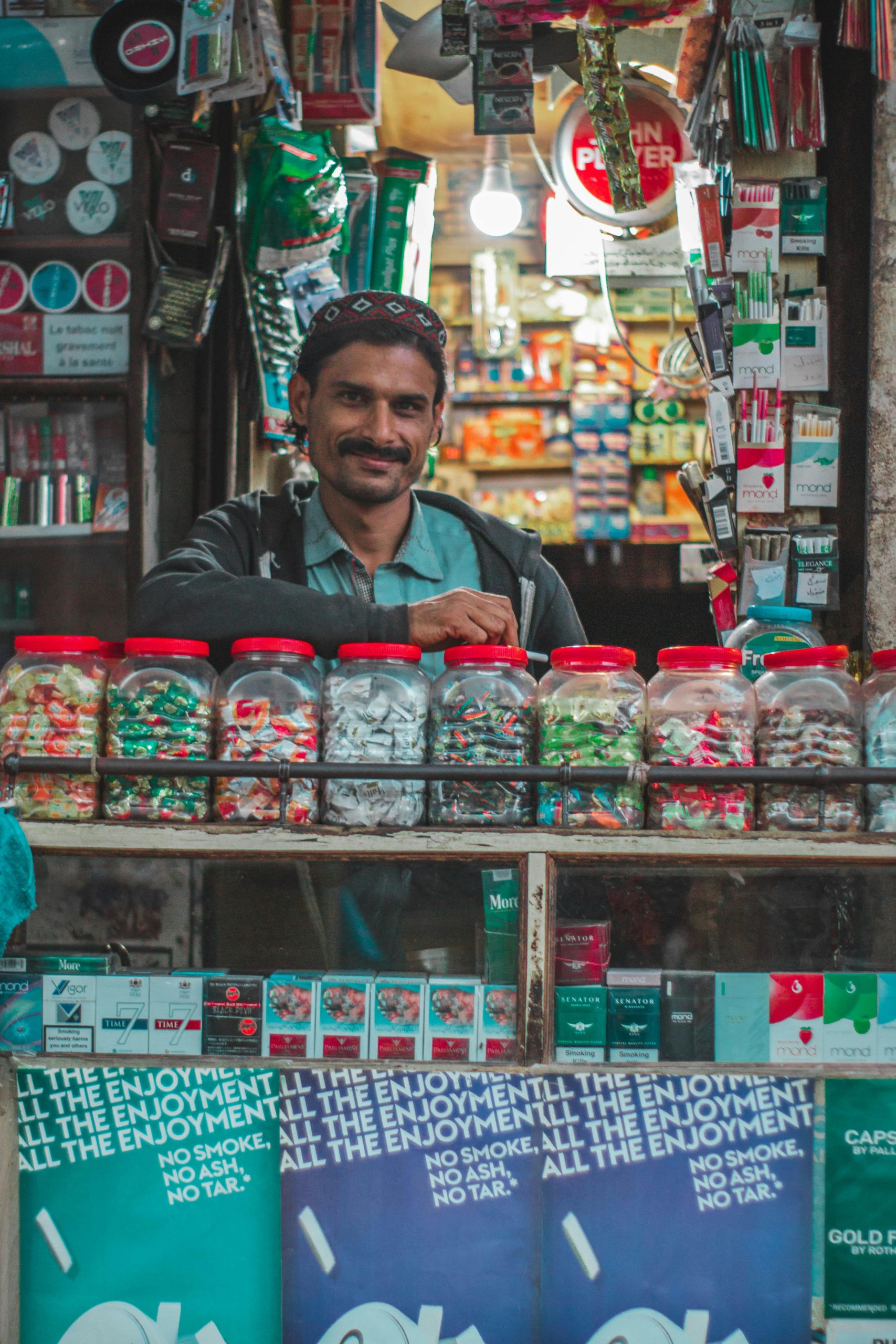
- Salons choose hairline fonts that look premium on desktop but collapse on Android mid-range phones. No one reads, no one books.
Most teams misunderstand three things:
1) Pretty isn’t persuasive. Visual hierarchy is the persuasion.
2) Mobile-first doesn’t mean squeezing desktop design. It means designing for thumb, speed, and clarity.
3) Fonts and color impact Core Web Vitals. Slow webfonts and low-contrast text hurt engagement which hurts rankings indirectly. Tight UX also supports landing page optimization and even a homepage that converts.
Deep dive: how fonts, colors, and layout really move conversions
Fonts: clarity, speed, and hierarchy
What works:
– Use a proven sans-serif: Inter, Source Sans 3, Roboto, or the native System UI stack. Variable fonts are fine if you keep weights to 2–3 and ship WOFF2 only.
– Base size 16–18 px, body line-height 1.5–1.7. Headings should scale clearly (e.g., H1 34–40, H2 26–30, H3 20–22 on desktop) and step down on mobile.
– Keep line length 60–75 characters. Longer lines kill scanability. See Baymard’s line length readability research.
– Avoid ultra-thin weights (100–300) for body. It photographs well, it doesn’t sell.
– Load fonts with font-display: swap and preconnect to your font host. Webfont FOIT/FOUT that jumps your layout will wreck LCP and trust. Pair this with ongoing website speed work.
Failure modes we fix a lot:
– Decorative headings (script/condensed) paired with a thin body. Pretty, unreadable.
– All-caps body, no letter spacing adjustments. If you must, +0.5 to +1% letter spacing.
– Mixing 4+ fonts to “add flair.” Pick one family, two weights, done. If you need visual hierarchy, use size, weight, and spacing.
Colors: contrast, states, and one clear CTA
Rules that convert without debate:
– One brand primary, one accent if you must, and a neutral gray scale. Your CTA should use the primary at a strong shade (think 600) and hover to 700.
– Contrast: follow WCAG AA at minimum. 4.5:1 for text. Start with the contrast minimum guidelines and stop shipping #9aa on white for body text.
– Never rely on color alone for state. Add shape/labels to error, success, and focus.
– Avoid pure black on pure white for large blocks. Near-black (#111–#222) reduces glare while staying compliant.
– Give CTAs purpose-built space. If everything is blue, your blue button is camouflage. Google’s Material guidance on harmonized palettes is solid; skim the Material Design color system.
Common failures:
– Ghost buttons for the primary action. These underperform almost always.
– Using red or green for CTAs because “they pop.” They also carry meaning (error/success) and can confuse.
– No disabled, hover, pressed, or focus states. Feels cheap and hurts accessibility which hurts completion.
Layouts: scanning patterns, grids, and thumb reach
- People scan in patterns. Design to the F-shaped pattern for reading web content: strong left alignment, decisive headings, and a right rail only if it’s critical.
- Container width 640–1200 px and an 8 px spacing scale simplify decisions and keep rhythm clean.
- One primary action per view. On mobile, sticky bottom “Book Now” or “Call” outperforms floating chaos. If you need the playbook, our CTA strategies break it down.
- Above-the-fold myths lead to cramped heroes. Give a clear headline, one benefit line, social proof, and the action. Then let the story breathe.
- Use predictable sections: value, proof, how it works, FAQs, final CTA. This aligns with UX design tips and helps with internal linking for SEO later.
Trade-offs we call out in planning:
– Image-heavy hero vs fast LCP. If your audience needs visuals (e.g., food), compress, lazy-load below the fold, and prioritize text and CTA for paint.
– Fancy animations vs INP. If your transitions block input, conversions dip. Save flair for micro moments, not gates to action.
– Custom fonts vs System UI. Custom looks nicer, System loads faster. On low budgets, we often choose speed and still win.
For a deeper lens on typography’s measurable impact on behavior, CXL’s typography and conversions guide is a useful sanity check.
Practical fixes you can deploy this week
Opinionated font stack and sizes
- Body: Inter or System UI stack.
- Headings: Same family, heavier weight, no decorative add-ons.
- Base size: 17 px; body 1.6 line-height; H1 36/1.2, H2 28/1.25, H3 22/1.3.
- Max text width: ~70ch. If your CMS can’t handle ch units, clamp with 640–720 px.
- If you serve Hindi or multi-script, use Noto families and test on common Android devices. Don’t guess.
Tight color system
- Palette: Primary (brand), Neutral scale (50–900), Semantic (success, warning, error).
- CTA: Primary-600 background, on-primary text at 10:1 contrast, 12–16 px horizontal padding, readable label like “Get Quote” not “Submit.”
- Critical states: hover +4% dark, focus 2 px outline with 3–4 px offset, disabled at ~40% opacity but keep legible.
- Don’t split attention. One CTA color site-wide. Secondary actions get outline or neutral.
Proven layout patterns for local businesses
- Restaurants: Hero with dish image, headline, rating snippet, and “Reserve a Table” primary. Back it with live social proof and a sticky bottom booking CTA. If you need the foundation, start with these website design tips for local businesses.
- Salons: Showcase styles with consistent image aspect ratio, visible pricing, and “Book Appointment.” Mobile gets sticky “Book on WhatsApp” where it makes sense. Then focus on mobile optimization.
- Home services: Lead with problem → solution → price range → trust badges → “Call Now” and “Get Estimate” side-by-side. Bring reviews near the CTA because reviews improve conversions.
Form and CTA hygiene
- One primary action per screen. Repeat it after social proof.
- Labels outside inputs, not placeholders.
- Phone input with click-to-call on mobile; WhatsApp optional if your buyers prefer chat.
- CTA copy is a contract. “See Plans,” “Get Quote,” “Book Table.” Vague “Learn More” is a stall. If you want the full playbook, see our CTA strategies.
Measure like an owner
- Ship with scroll-depth, click, and form-abandon tracking from day one. Heatmaps help find dead zones. If you don’t have a setup, start with our walkthrough on heatmaps and analytics.
- A/B test only the highest-leverage elements: headline, CTA copy/color/placement, hero layout. Don’t boil the ocean.
Tie design to speed and SEO
- Fonts: Preload a single WOFF2, limit weights, and set font-display: swap. This plus image optimization addresses 70% of your LCP issues alongside broader website speed work.
- Semantics: H1 once, clear H2s/H3s, descriptive alt text, and a scannable structure. This sets you up for better engagement and easier landing page optimization later.
- Your homepage’s UX and content should back your local intent. If you haven’t done this, revisit how to optimize your homepage for local SEO and then iterate into a homepage that converts.
Real-world patterns that tend to win
- A sharp headline + value line + one CTA beats sliders and carousels. If you need a baseline, our piece on create a business website gives the non-fancy checklist to start right.
- Social proof near the CTA, not buried. Pair it with trust badges. Read how to build trust on your website.
- Mobile-first grids with fixed container and predictable spacing. Cumulative Layout Shift tends to vanish when you set image dimensions and reduce font jumps. If you’re new to UX structure, skim our UX design tips.
Also, don’t overthink color psychology beyond basics. Clarity, contrast, and consistent use of your primary color will beat “orange converts better” myths ten times out of ten.
Business impact (numbers you can defend)
- Readability changes alone (font size, line length, contrast) often lift form completion 5–12% on service sites.
- A single consistent primary CTA color and location can reduce decision friction and increase click-through 8–20% depending on baseline clutter.
- Simplified layout plus speed work cuts bounce. Faster fonts and images regularly remove 300–800 ms from LCP which helps rankings indirectly and makes paid traffic less wasteful. Stack this with mobile optimization and you’ll see the effect in calls, not just metrics.
- For restaurants and salons, nudging more visitors to immediate booking yields the fastest ROI. Make “Reserve” or “Book Now” unavoidable and watch the calendar fill. Pair that with a sound homepage that converts and it sustains.
If you need external references while auditing, the NN/g piece on the F-shaped pattern for reading is a good gut-check, Material’s color system keeps palettes sane, CXL’s typography and conversions guide is practical, and WCAG’s contrast minimum guidelines keep you compliant.
Quick takeaways
- Stop using light-gray 14 px body text. Go 16–18 px with proper contrast.
- One font family, two weights, max. Ship WOFF2, font-display: swap.
- One primary CTA color, site-wide. Strong states, real labels.
- Containerized layout, 8 px spacing, 60–75 ch text width.
- Place proof near action. Don’t hide reviews; they improve conversions.
- Instrument the page. Use heatmaps and analytics before you debate opinions.
- If you’re rebuilding, follow core website design tips for local businesses and iterate into landing page optimization.
If you’re stuck, we fix this for a living
We design for conversions first and looks second. If your bookings, calls, or forms are underperforming, this is exactly the kind of work we do: fonts that read, colors that guide, layouts that sell. We can audit and refactor your pages end-to-end, wire it into your analytics, and align it with local intent so the gains are durable. If that sounds useful, we can start with your hero, CTA, and top-fold structure and work down. Read more on how we create a homepage that converts and tune your site with focused CTA strategies.
P.S. If you haven’t set a UX baseline yet, fix the low-hanging fruit first with website speed and structure, then layer in trust with build trust on your website.